Application system
Designing complex systems to enable university applications
Output
High fidelity mockups
Wireframes and flows
Clickable prototypes
Documentation and workshops
Skills
UX design
Design thinking
Stakeholder collaboration
UI design
Context
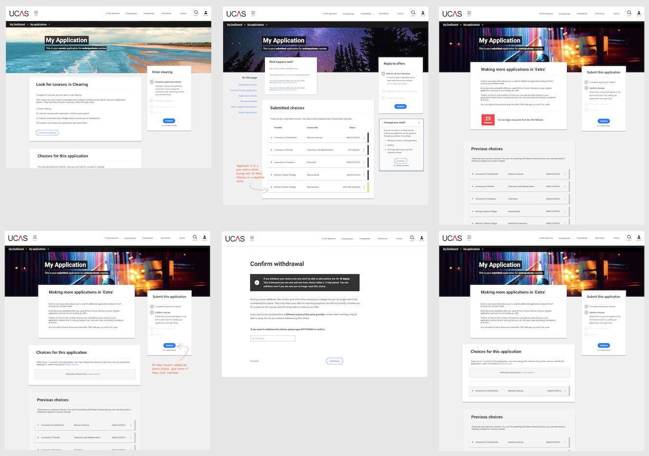
Image: My designs of various application states
For this project, the primary personas represented two major user types:
- Students - submitting and managing application
- University staff - reviewing students’ applications
The application system was a long, segmented form, with screens for monitoring progress and status
Problem
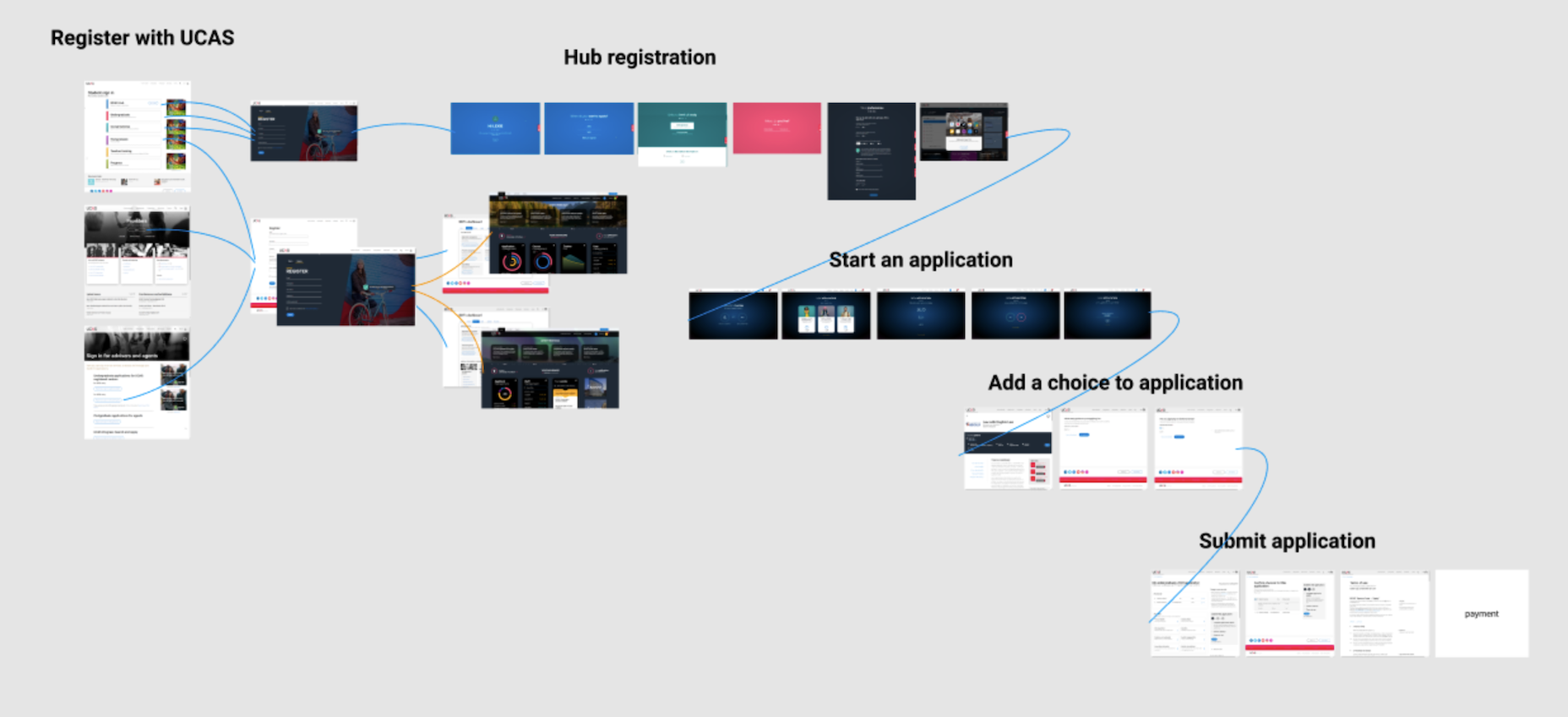
Image: Flow demonstrating how many obstacles users must complete before starting the application
Application form was very long and would require multiple sessions to complete
Question wording was sometimes obtuse, but couldn't be changed for legal reasons
Major, and often opaque, technical contraints from legacy systems and development capability within UCAS
Balancing the students' need to easily and quickly complete, against the universities' need for accurate and comprehensive data
Design approach
Image: Diagram UX flow
With complex requirements and flows, heavy design thinking needed to go into the UX journey for each feature
I would collaborate with product owners, specialists, and engineers to understand the constraints and opportunities
Using experience and knowledge of usability and the application UX as a whole, I guided implementation to minimize usability and content design risks
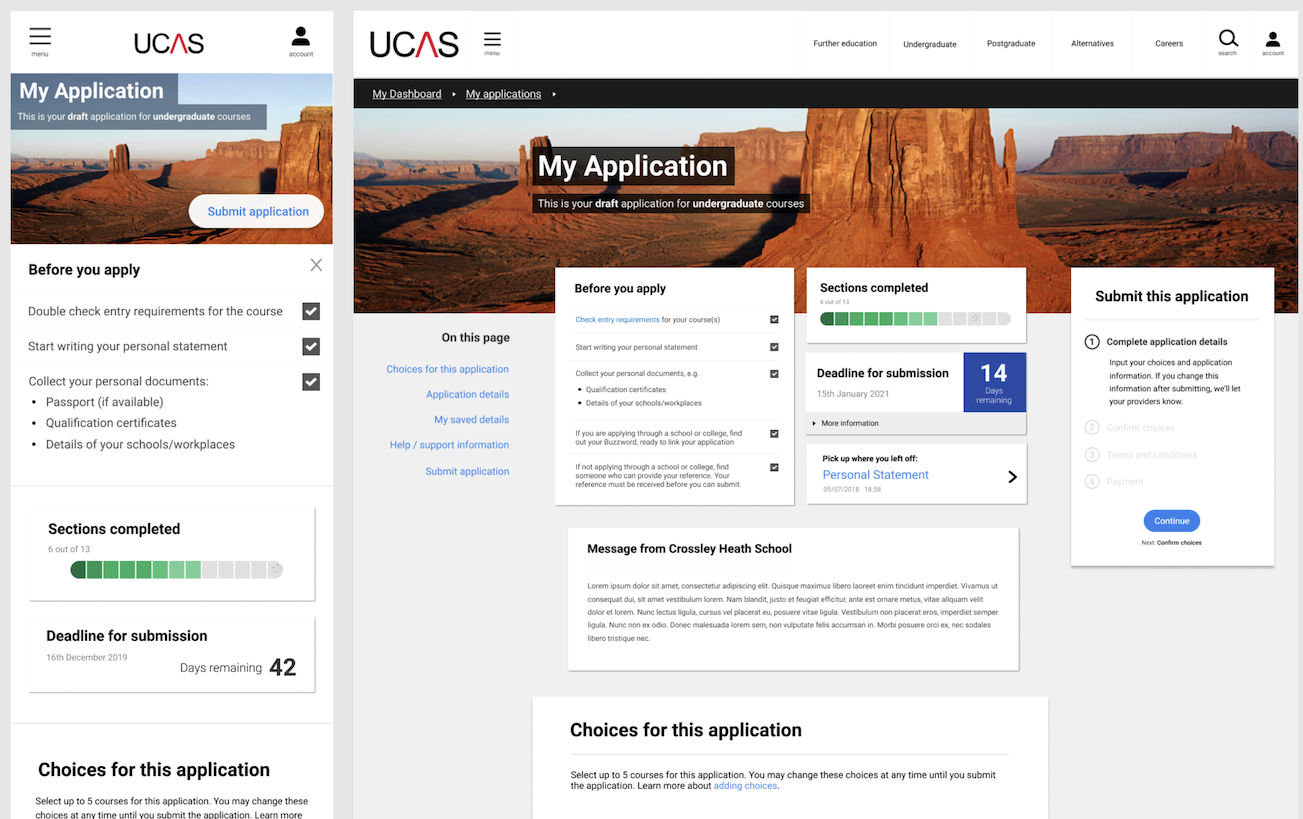
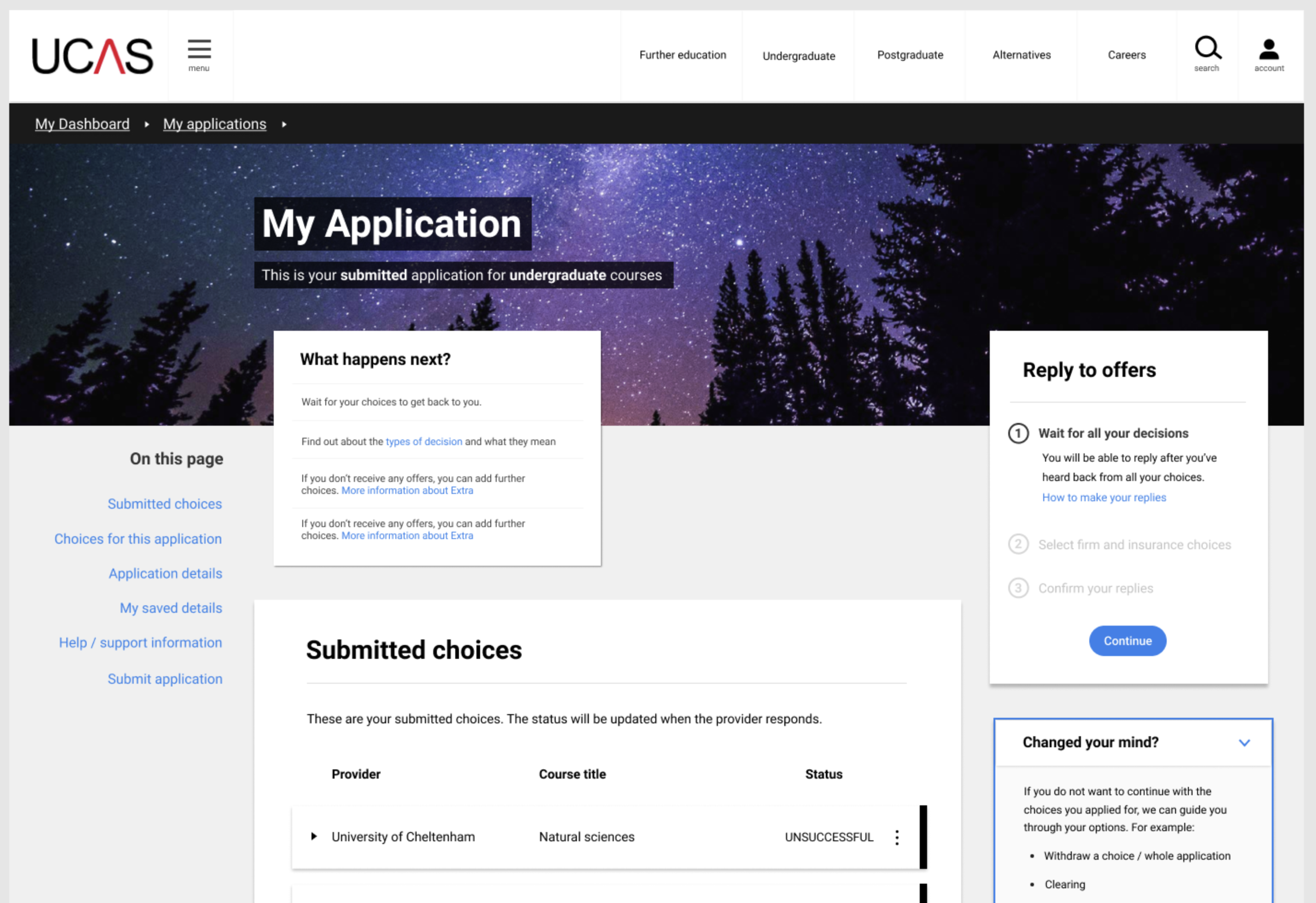
Image: Mobile and desktop application homepage
The application was complex, and usually accessed on desktop devices in schools
However, using responsive and progressive enhancement principles allowed me to design for a mobile experience
Tasks such as checking status and responding to alerts was shown from user research to be the crucial opportunity of the mobile experience for students
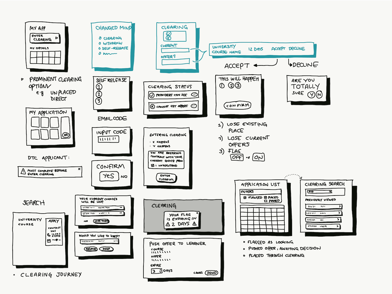
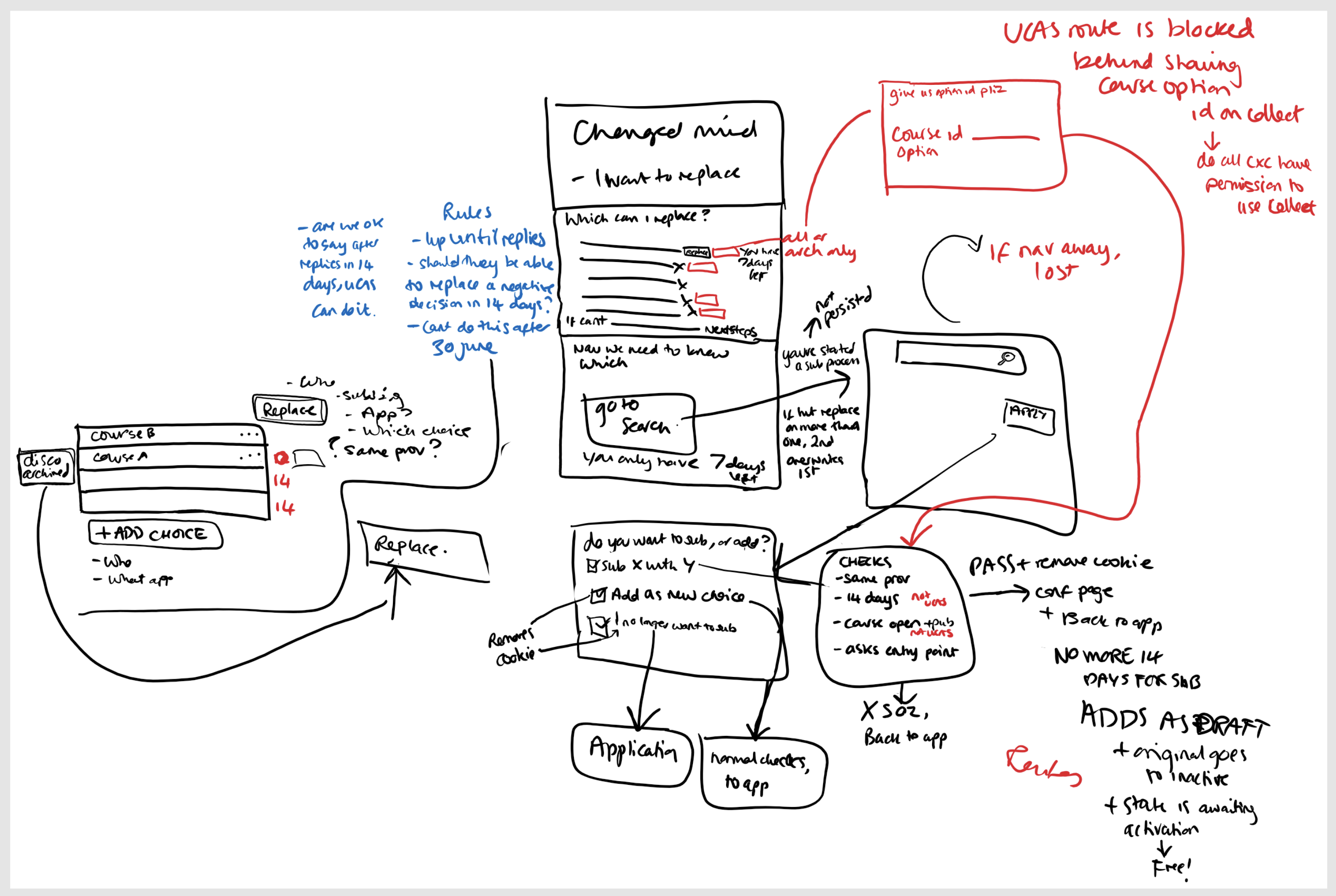
Image: Wireframes showing a specific UX flow
In addition to the main application journey, there were subtasks and niche scenarios
What a user could do often depended on complex criteria, which were challenging to communicate clearly
I often needed to articulate these journeys to stakeholders and SMEs in order to validate the logic against the necessary process
I also ran webinars and seminars with users (universities, teachers) to understand their needs and issues with the journeys under review
Collaboration
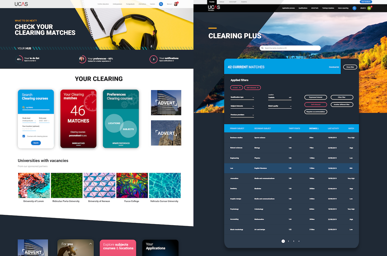
Image: Showing a different design style to align with UCAS' website
In addition to my main work on the application, I worked with other teams within the business
Using my knowledge of the application software, I designed a search function for students in clearing
This required me to use the website style guide, and also switch from Figma to Adobe xD in order to pick up assets from another designer