Mobile app journey
Redesigning a call journey to maximize usability across complex journeys
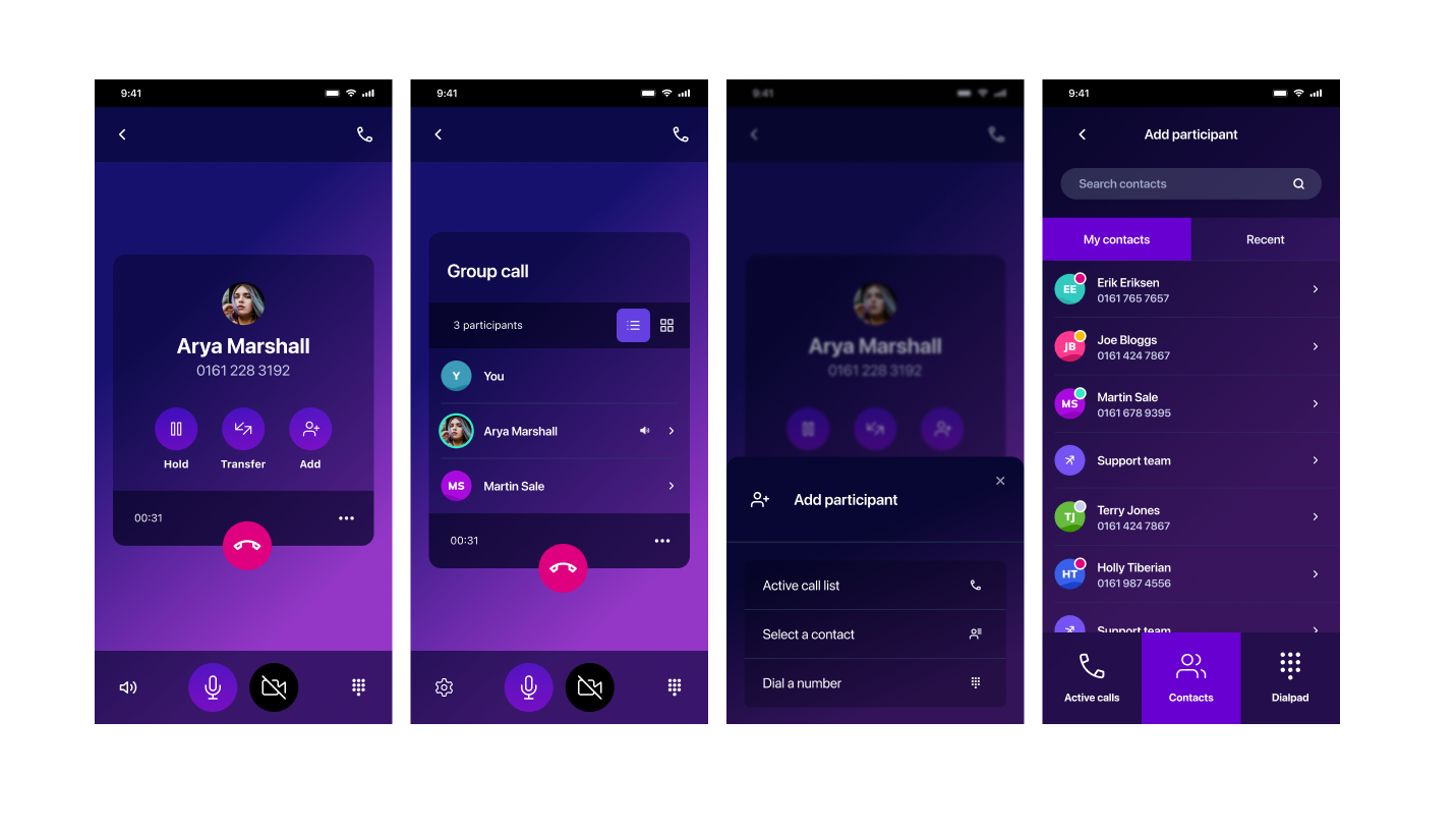
Output
High fidelity mockups
Clickable prototype
Usability test
Dev-friendly iteration plan
Edge-case documentation
Skills
UX design
Design thinking
UI design
User research
Developer collaboration
Context
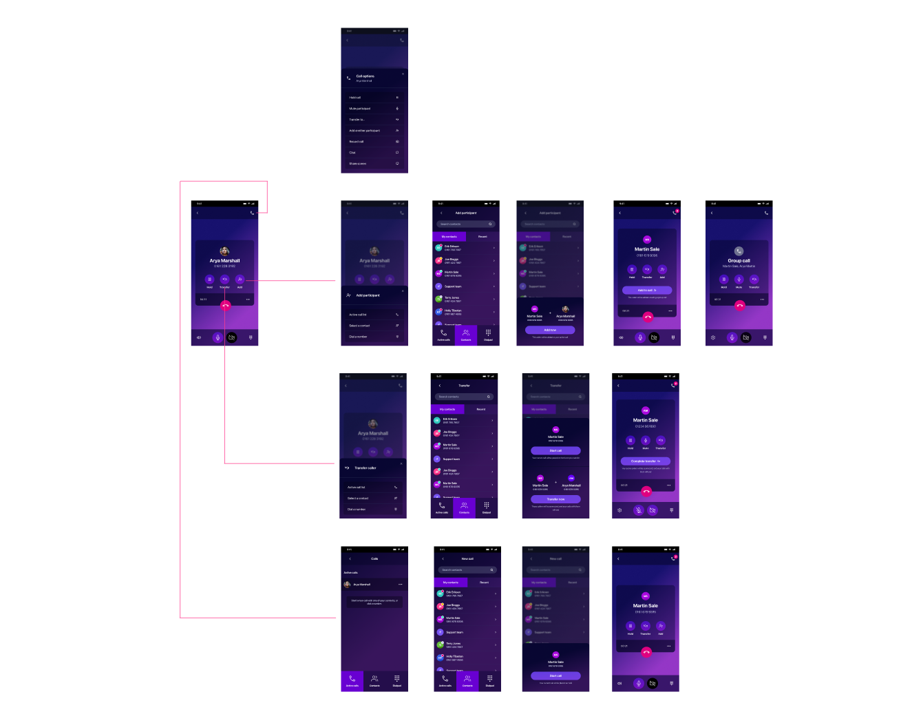
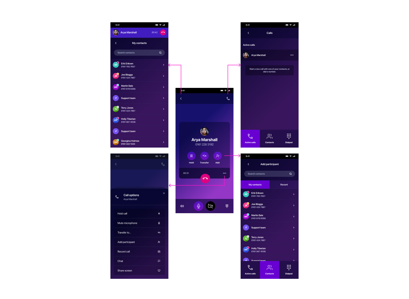
Image: Example of some main journeys from the call screen
Initial brief was to add conference call feature into a softphone app on iOS
Screen needed to be clear and easy, but also support some quite complex call journeys
Users of the app value speed and simplicity, as they use this interface for work
Problem
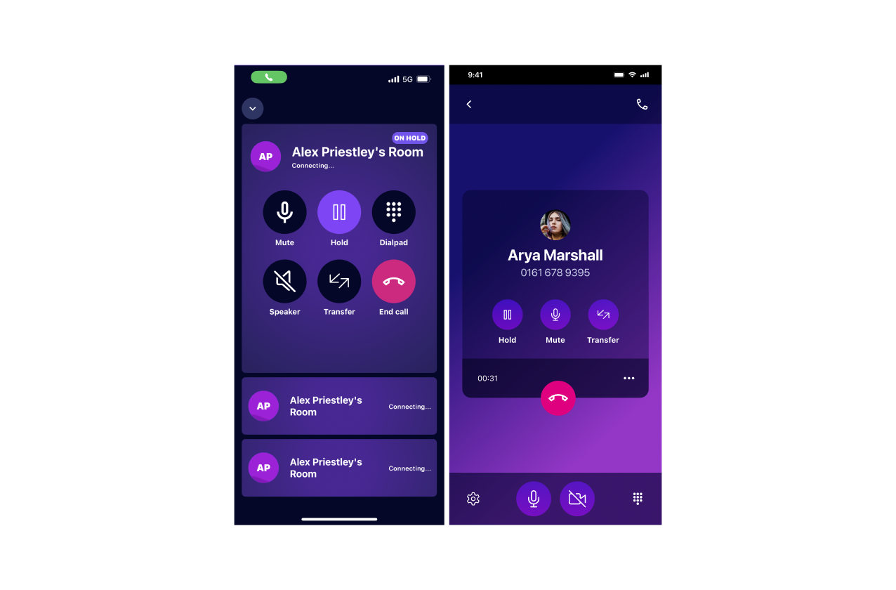
Image: Call screen UI before redesign and after
Call screens on mobile app were already cluttered and unintuitive
Upcoming features would only add further complexity and confusion
Features I needed to consider included: Screensharing, group call participant list, video calling, and conferencing
Some journeys would require users to navigate several screens in order to select contacts and manage participants
Design approach
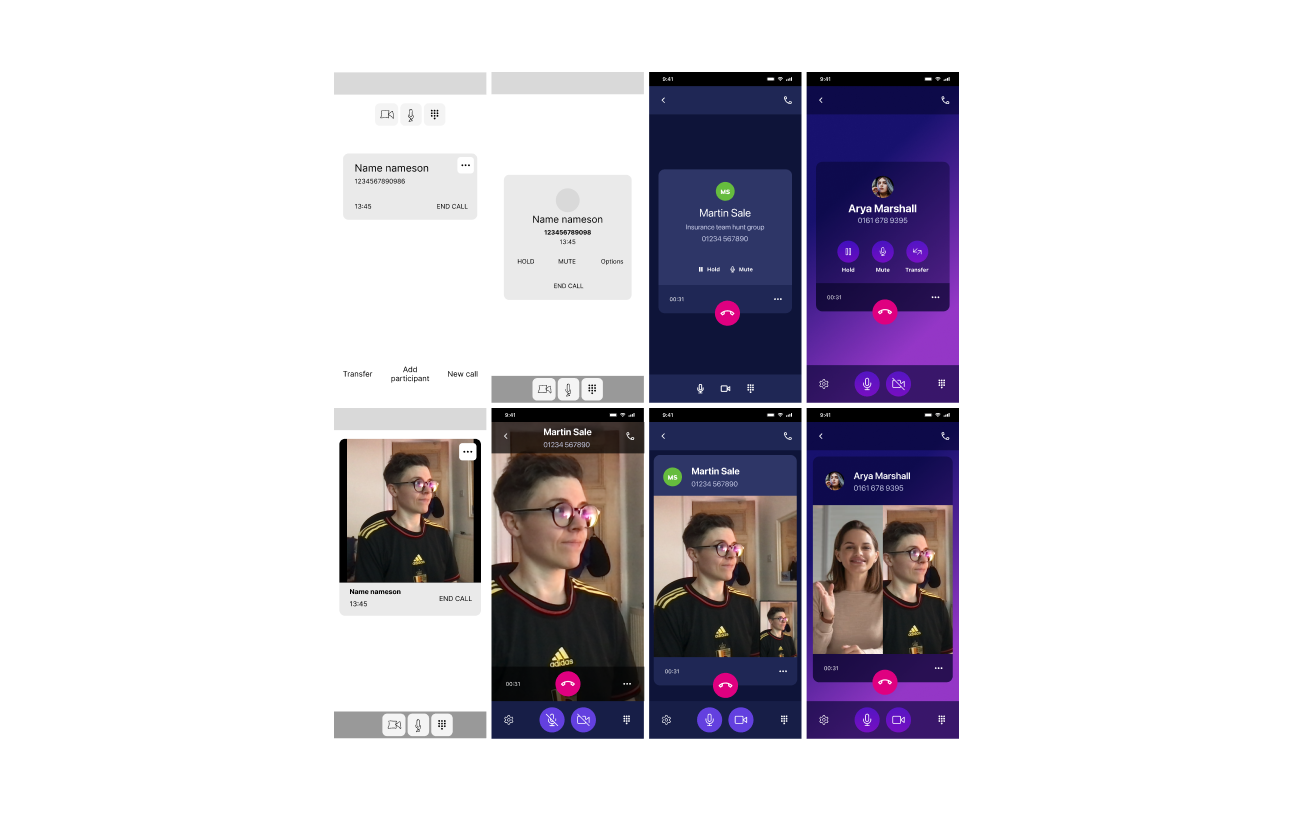
Image: Iterating and adding fidelity to mockups
My aim was to completely redesign the call journey
Firstly to improve usability, but also to futureproof for more features to be added over time
To begin, I prioritized call screen features in order of importance and frequency
Created wireframes to experiment with different layouts
Ensured each layout can account for the most complex scenarios, while remaining simple and readable
Increased the fidelity to explore how different layouts could work in practice
Refined the designs and ensured consistency across different screen variations
Research plan
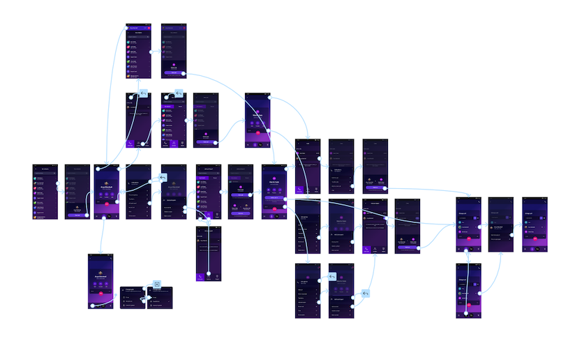
Image: Figma prototype for testing
My designs simplified and added hierarchy to the main screen
However, I was concerned that by moving some options into menus, users might struggle to navigate
Created a set of tasks to take users through a few journeys to understand overall usability and comprehension
A conference could be created multiple ways. I was interested in whether this journey was intutive, and which path users would pick
Prototyped the journeys in Figma, accounting for different journeys and backtracking
Testing
Image: Ways a user could begin a conference call journey
Ran remote testing through Userzoom and reviewed the session recordings
Overall, the designs were successful. Users found at least one way to begin a conference call, and easily completed shorter tasks such as muting, changing audio, and navigating between calls.
Unexpectedly, users thought they'd have to put the current caller on hold before being able to dial another number
When prompted to try starting a conference call a different way from their initial choice, users struggled
Collaboration
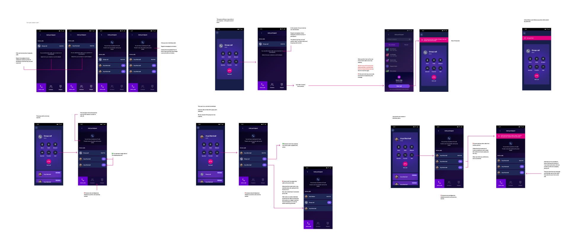
Image: Marking up edge-case behaviours
I presented back my designs and test findings to stakeholders and my product team
Discussion with development highlighted a need to prioritize my proposed changes so the redesign could be tackled iteratively
Taking my designs as an endpoint, I reverse engineered the UI to provide a breakdown of smaller changes which could slot into sprints
Development uncovered some rare edge-cases and journeys, for which I needed to define UX behaviour
These included microcopy for error states, messaging to handle extreme cases, and preventing users from starting journeys which cannot be completed for technical reasons