Design system implementation
Leading on accessible component development

Output
HTML prototype
Accessibility remediation
Developer guidelines
Accessible components
Skills
UI design
HTML/CSS/JS
Componentization
Developer collaboration

Context
Image: Providing CSS feedback to help devs match the designs
Great deal of inconsistency in UI and UX approach across and within our products
UI elements weren't componentised, and existing UX pattern library was insufficient to meet complex demands of our products
To minimize inconsistency, I helped developers by specifying HTML and CSS changes and tweaks
However, it was clear that the UX team needed to create design components which developers could use out of the box
I collaborated with the designer leading on component creation, inputting on usablity, accessibility, and implementation
Iconography
Image: Auditing the icons and styles we use in products
Icons were a problem area - both visually inconsistent, and in implementation
Initially we assumed centralised SVG assets would be the easiest way to ensure icons are sized and styled correctly
However, after collaboration with developers, it became clear that SVGs added another variable for confusion and inconsistency
While more lightweight than raster assets, SVGs also create additional DOM elements, reducing accessibility and performance
I spiked the work it would take to replace our icons with, for example, the Material Design symbols icon font
Feeding this back to the UX and development teams, this proved to be an effective measure for ensuring consistency and minimal development effort

Figma components
Image: A design component I built in Figma
To build out a pattern library, I collaborated with UX colleagues to build components for reuse throughout our products
As we primarily use Figma for design, we developed a component library using its built-in tools for components and instances
This involved a comprehensive understanding of Figma, to ensure components were easy to use and adapt

Accessibility guidance
Image: Accessibility plan and set of informational resources
I wanted to ensure accessibility was incorporated into the design system from the start
As the subject-matter expert within my team, I compiled resources such as contrast checkers and information sources
This plan provided a framework to ensure everyone was taking responsibility for thinking about accessibility

Accessibility audits
Image: Documentation of accessibility issues and solutions in a product
In my own time I begun studying more about how to put accessiblity into practice
I tested accessibility within our own products and looked up how to fix these issues
Sharing these findings has allowed the business to fix issues quickly and without additional cost
HTML prototype
Image: HTML prototype of a login page using components I built
As the design system in Figma was developed, I was keen to ensure patterns were able to be built in a way which maximized accessibility, performance, and ease of implementation
Prototyping the design system components in HTML meant we could test their feasiblity
Creating components in code also helped my team understand the utility of design tokens, which we have begun to implement into Figma
The prototype will also serve as a code-as-documentation guide for developers to build accessible and pixel-perfect components
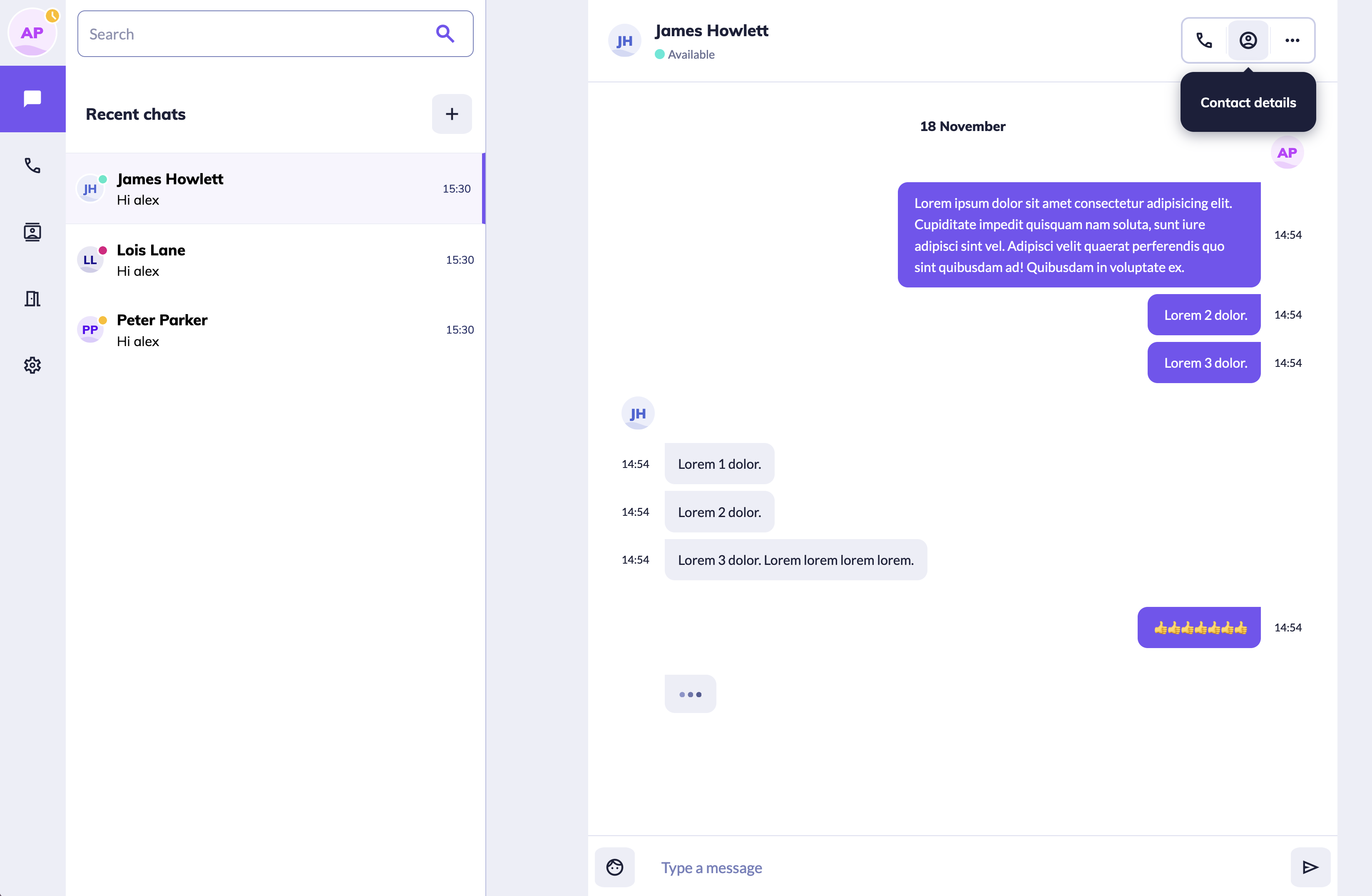
Future prototypes
Image: Top right shows a HTML version of the tooltip component I designed
This page is a prototype of a chat page from one of our products. The next step will be adding more functionality to enable user testing
Testing will allow us to benchmark usability of components against current patterns, and demonstrate value